Reimagined Quote Summary
Project Overview
Spring 2024 - Fall 2024
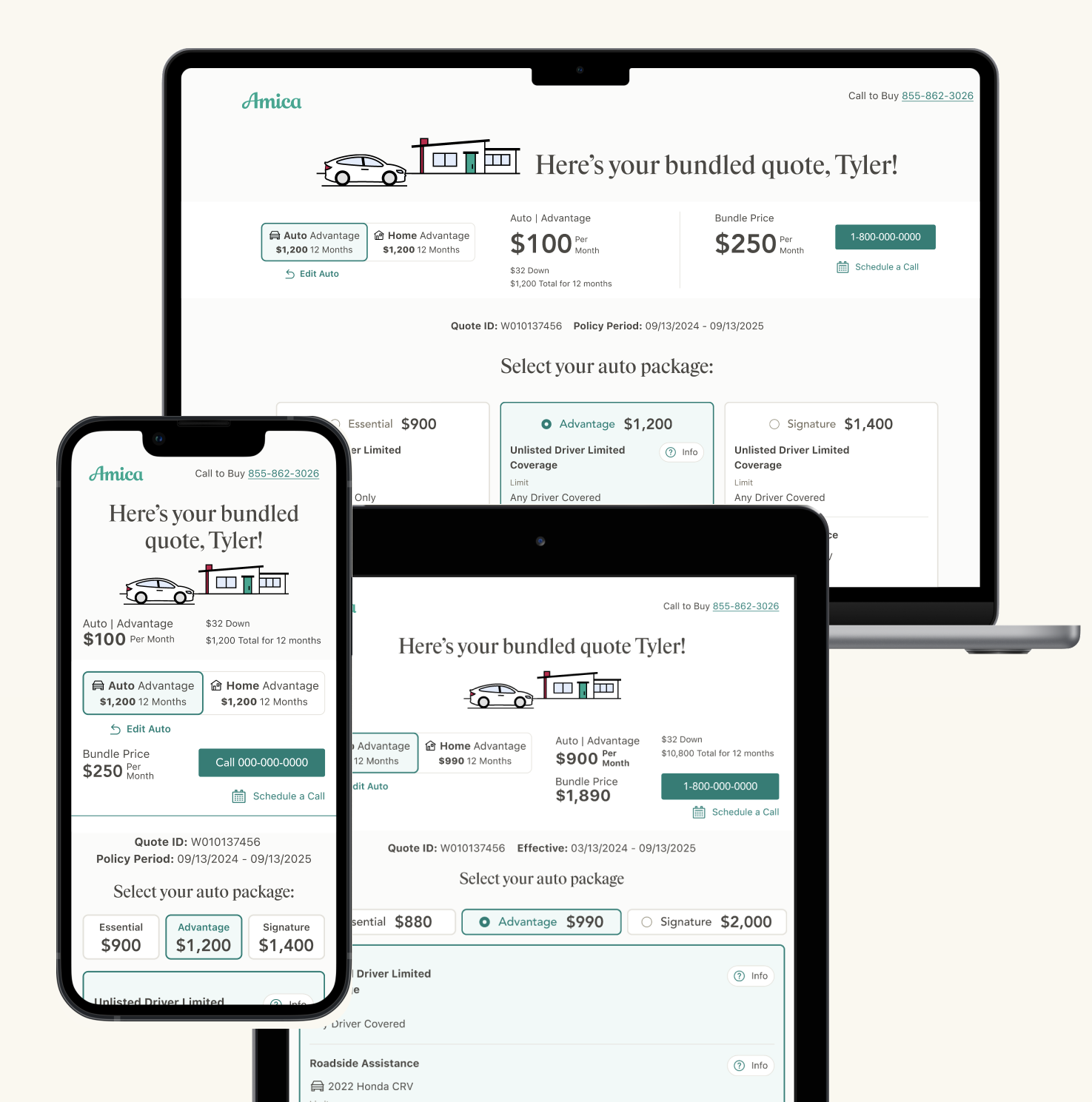
In 2024, I worked on Amica's largest initiative: a redesign of the "quote summary" page. This is the page a user sees after completing their quote, where they receive their rates, can customize their options, and choose to call or purchase a policy online (when applicable).
The redesign goal was to create a quote summary that accommodates the new product's complexities and enables buyers to make the best choice for their policy.
-
As a strong advocate for paired design, I introduced a new approach to collaboration with my lead designer on this project, helping us work together efficiently to meet the challenging deadline. Through effective teamwork, we were able to brainstorm, collaborate, and problem solve.
-
My role involved shaping the original concept, setting up Figma files for handoff, and collaborating with a design lead to develop a test plan with a researcher. We divided up the work, with the lead focusing on creating low-fidelity prototypes for testing, while I handled fleshing out the handoff mockups and high-fidelity designs for final delivery.
Project Background
Comparing new to old
Although "tiers" previously existed on the current quote summary page, a new product in the works required altering the current experience to offer buyers greater flexibility, and attract a demographic seeking more affordable insurance rates.
Unlike the previous quote summary experience, which offers three locked-in quotes and a customizable fourth quote, the new product simplifies coverages into two categories: packaged and nonpackaged coverages. Nonpackaged coverages, known as "core" coverages, can be freely edited. The packaged coverages, referred to as "tiered" coverages, are limited in editability based on the package contents.
The previous design (left) offered 3 quotes, with a 4th quote unlocking if the user customizes. The new experience (right) allows for free editing and focuses on the packages.
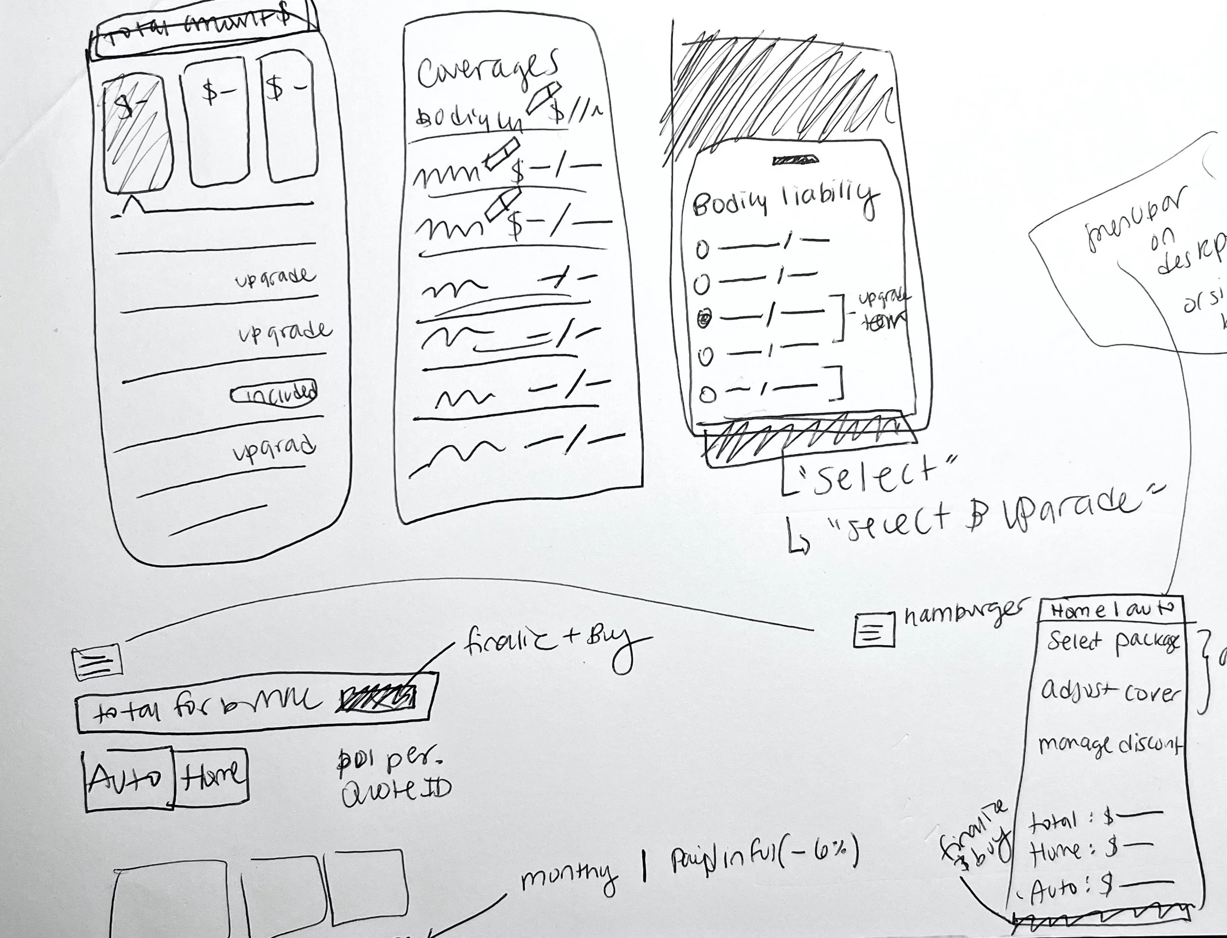
Early mobile-first sketches
Conceptualizing
Early brainstorming sessions with Product Owners and BAs shaped an idea to leverage a familiar UX pattern to display the new "tiered" coverages: a comparison grid, similar to those used to compare Netflix or Spotify plans. However, shopping for insurance is significantly more complex than these interfaces. This led us to several challenges and hypotheses to explore with our UX researcher.
UX Research
organizing “core” coverages with package related limitations
The first round of testing revealed a 60% task completion rate when users edited their roadside assistance. Despite being a 'tiered' coverage, it was grouped with core coverages due to its vehicle-specific nature. Users struggled to realize they needed to change tiers for options to become available. Moving roadside assistance back into the comparison grid with other tiered coverages boosted the task completion rate to 90%.
Would users prefer selecting their "package" coverage before their "core" coverage?
Competitors typically allow users to edit core coverages, like Bodily Injury Liability, first, but in our design, these would appear lower on the page under the new comparison grid. Testing two designs (core first vs tiered first) revealed that 76% of users preferred having the tiers presented first. One user stated, "I prefer having the comparison table higher up so I can easily compare the plans and select one. Once I do that, I would tailor the coverages to my needs."
Price Bar Component
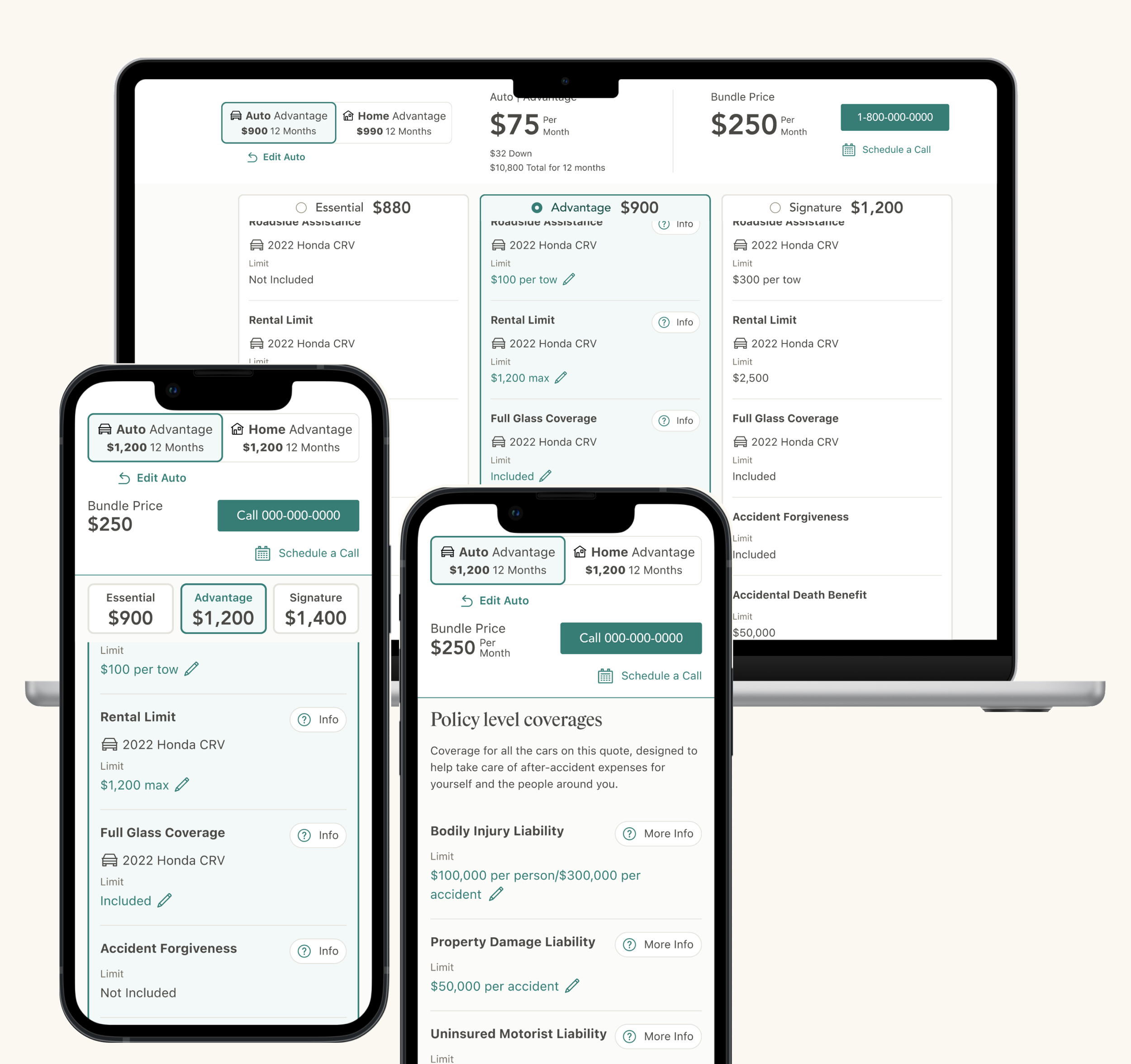
The package ‘sticky header’ selectors stick to the bottom of the price bar, so the user can easily change their package while scanning.
Important information is Remains in view
In addition to the comparison grid, we introduced a new element the ‘price bar’ to enhance user decision-making.
We designed this component to follow users down the page, offering a quick snapshot of prices and easy access to purchase or call.
Third-party research from Accenture indicated that users preferred visibility of different tier prices while navigating. Our testing revealed that 78% of users favored displaying these in 'sticky headers' beneath the price bar while scrolling over the package coverages.
Once the user is no longer selecting their package, the sticky headers hide.
Editing a Coverage
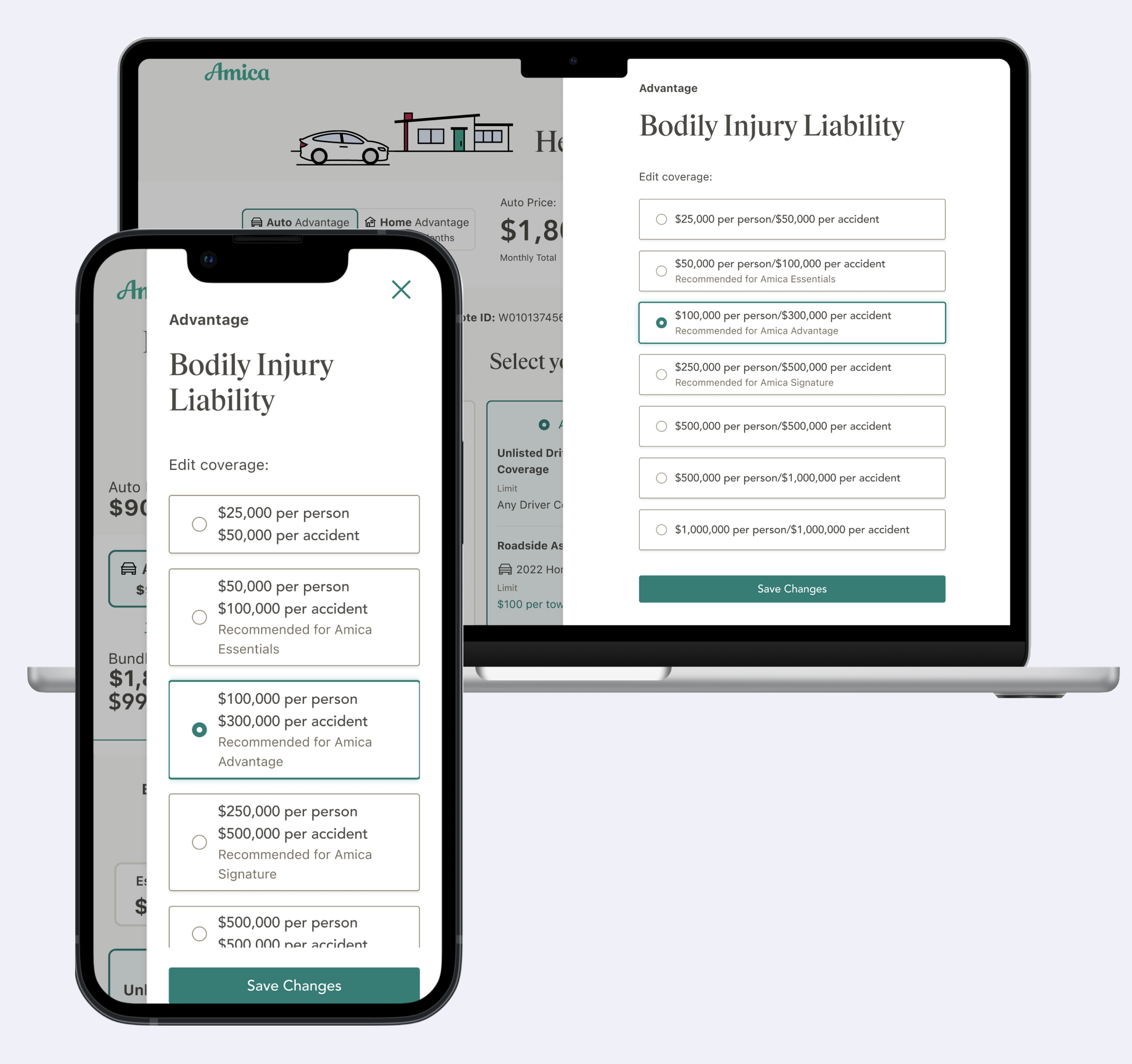
Leveraging an existing 'flyout' component allowed us to provide users with more space than previous dropdowns for editing their coverages.
While core coverages can be freely edited, we aimed to guide users in their choices. Our testing showed that 79% of users strongly approved of the displaying text indicating the 'recommended' default for their selected package.
Additionally, users expressed a desire to know their current tier while editing coverage. Based on this feedback, we added an 'eyebrow' displaying the tier name above the header.
To change a coverage amount, users interact with this side panel.
